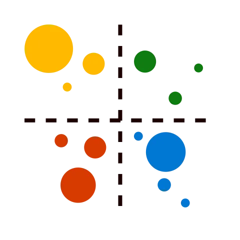
Quadrant Chart
Represent data in separate quadrants to show distribution and items that share common traits.

Visual at a glance
- Category
- Correlation
- Certification
- Power BI Certified
- Best used for
- Represent data in separate quadrants to show distribution and items that share common traits.
About Quadrant Chart
Represent large quantities of information in a compact space. Quadrant Chart by MAQ Software is a bubble chart with a background divided into four equal sections. This visual is useful for plotting data that contains three measures using an X-axis, a Y-axis, and varying bubble sizes that represent the value of the third measure. Quadrant Chart by MAQ Software is useful for showing relationships. Divide the four sections of the chart to rate performance as bad, good, better, or best.
Key Feature
- Customizable bubble colors
- Formatting options for quadrants and quadrant lines including naming for each quadrant, X-axis division line, Y-axis division line, and a choice of dotted or solid lines
- Custom title, labels, display units, and decimal points for each axis
- Supports context menu
Business uses
- Sales – Showcase the relationship between production costs and gross profit, using the bubble size to represent units sold
- Marketing – Highlight the effect of advertising expenditure on product sales, using the bubble to represent conversions
- Finance – Represent the regions where your product sells best, breaking down success by sales and quantity of store fronts
What's new
- Updated the visual to Power BI API 5.11.0 and implemented the new Formatting Pane model.
- Upgraded the visual to Power BI API 5.11.0.
- Implemented the new Formatting Pane model.
- Resolved project warnings and improved compatibility.
Feature walkthrough
Contact Us. Thank you for using Quadrant Chart by MAQ Software. Have questions about this or any of our other Power BI custom visuals? For issues, contact Support@MAQSoftware.com. For priority requests or custom builds, contact CustomerSuccess@MAQSoftware.com.
FAQs
What is the Quadrant Chart visual used for?
The Quadrant Chart visual displays data points in four quadrants to help users analyze relationships between measures and identify items that share common characteristics. It uses a bubble chart layout with quadrant divisions to categorize performance and trends.
What data fields are required?
The visual requires:
- X-Axis measure
- Y-Axis measure
- Bubble Size measure
An optional category field can be used to identify individual data points.
Which business scenarios is this visual best suited for?
The Quadrant Chart visual is commonly used for:
- Sales performance analysis
- Production cost versus profit analysis
- Marketing campaign effectiveness
- Advertising expenditure versus conversions
- Regional sales comparison
- Financial performance analysis
- Product portfolio assessment
- Strategic business planning
Can I customize the appearance of the Quadrant Chart?
Yes. You can customize:
- Bubble colours
- Quadrant colours
- Data labels
- Chart title
- Axis titles
- Display units
- Decimal places
Can I customize the quadrant names?
Yes. The visual allows you to assign custom names to each quadrant, making it easier to classify data based on your business requirements.
Can I customize the quadrant division lines?
Yes. You can customize:
- X-axis division line
- Y-axis division line
- Division line styles (solid or dotted)
- Quadrant formatting options
What does the bubble size represent?
The bubble size represents the value of a third measure, allowing users to visualize three measures simultaneously within a single chart.
What makes the Quadrant Chart different from a Scatter Chart?
The Quadrant Chart includes configurable vertical and horizontal division lines that split the chart into four sections. This helps users categorize and evaluate performance, such as bad, good, better, or best, while still maintaining scatter chart functionality.
Does the visual support cross-filtering?
Yes. The visual supports Power BI cross-filtering.
Selections made within the Quadrant Chart filter other visuals on the report page and respond to filters applied from other visuals.
Does the visual support report tooltips?
Yes. The Quadrant Chart supports Power BI Report Page Tooltips, allowing users to display additional contextual information when hovering over data points.
Does the visual support bookmarks?
Yes. The visual supports Power BI Bookmarks, enabling report authors to save and restore report states while maintaining visual interactions and configurations.
Can I customize axis titles and labels?
Yes. You can customize:
- X-axis title
- Y-axis title
- Data labels
- Display units
- Decimal precision
- This helps improve report readability and presentation.
Can I compare multiple measures in a single visual?
Yes. The Quadrant Chart allows users to analyze:
- One measure on the X-axis
- One measure on the Y-axis
- One measure as bubble size
- This enables multidimensional analysis within a single visual.
Is the Quadrant Chart responsive?
Yes. The visual automatically adjusts to different report sizes and layouts to provide an optimal viewing experience.
Is Quadrant Chart certified by Microsoft?
Yes. The Quadrant Chart is certified by Microsoft and complies with Microsoft's certification requirements for Power BI custom visuals.
Where can I report issues or request new features?
For support, bug reports, or feature requests, contact:
- customersuccess@maqsoftware.com
We regularly update the visual with enhancements, performance improvements, and new features based on customer feedback.