All Power BI custom visuals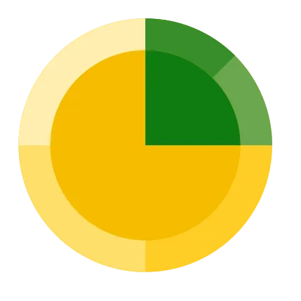
Sunburst
Break down hierarchical data using color coded concentric rings
Visual at a glance
Category
Clustering
Certification
Power BI Certified
Best used for
Break down hierarchical data using color coded concentric rings
About Sunburst
Identify patterns in data that might otherwise go unnoticed. Sunburst by MAQ Software allows users to display hierarchical data as a set of nested rings. Customizable colors make it easy to distinguish between categories. The chart is displayed as a radial tree map or multilevel pie chart, presenting the data as parts of a whole.
Key benefits
- Hierarchical view of grouped categories with an expand/collapse option for each level
- Color-coded concentric rings based on category
- Tooltips for category labels and data values
- Support for date formatting
- Support for context menu
- Interactive with other visuals
Use cases
- Sales – Highlight your sales distribution across multiple demographics and geographies
- International Sales – Identify your most valuable exports broken down by location
- Finance – Break down and understand the revenue sources across your entire business
Feature walkthrough
MAQ SoftwareSunburst
For a demo video, please visit ourYouTube channelFor technical support, please visit ourPower BI community forum
Contact Us. Thank you for using Sunburst by MAQ Software. Have questions about this or any of our other Power BI custom visuals? For issues, contact Support@MAQSoftware.com. For priority requests or custom builds, contact CustomerSuccess@MAQSoftware.com.