All Power BI custom visuals
Histogram With Points
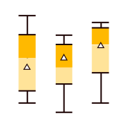
Displays density of distribution using bars along with actual values represented by points
Visual at a glance
Category
Distribution
Certification
Power BI Certified
Best used for
Displays density of distribution using bars along with actual values represented by points
About Histogram With Points
Traditional histogram charts illustrate the density of distributed data, but normally do not showcase specific values. Histogram with Points by MAQ Software addresses this issue by combining a histogram chart with points that show the actual data for each range. Easily track where data clusters (points) are across your data distribution (bars) to identify patterns, trends, and areas of opportunity.
Key benefits
- Configurable points and histogram bars
- Configurable X-axis, Y-axis-right, or Y-axis-left
- Configurable gridlines
- Able to show/hide all the elements listed above
Use cases
- Research: Find homogenized populations of customers
- Marketing: Identify vital demographic clusters for promotional campaigns
- Admin: Display employee salary distribution and salary variation for individual employees
What's new
- Enhance license notification handling and improve service plan checks in HistogramXY visual.
Feature walkthrough
MAQ SoftwareHistogram With Points
For a demo video, please visit ourYouTube channelFor technical support, please visit ourPower BI community forum
Contact Us. Thank you for using Histogram With Points by MAQ Software. Have questions about this or any of our other Power BI custom visuals? For issues, contact Support@MAQSoftware.com. For priority requests or custom builds, contact CustomerSuccess@MAQSoftware.com.