All Power BI custom visuals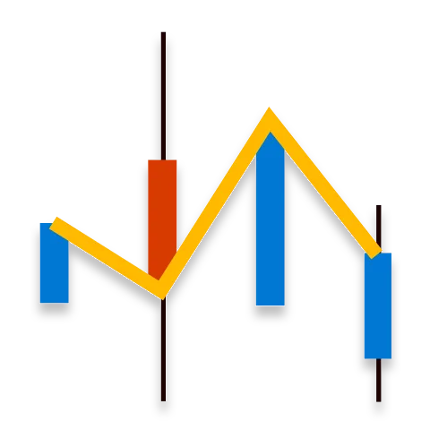
Trading Chart
Break down historical trading records into a simple, color-coded chart
Visual at a glance
Category
Change Over Time
Certification
Power BI Certified
Best used for
Break down historical trading records into a simple, color-coded chart
About Trading Chart
Trading Chart by MAQ Software translates historical trading records into an easy-to-read chart. Gray bars signify low and high price values. Red or green bars superimposed over the low and high values indicate the direction the stock moved.
Key Feature
- Color-coded bars (red bar indicates a stock's price has dropped; a green bar indicates the price rose)
- Customizable price ranges and time increments
Business uses
- Finance: Analyze the state of the stock market to make informed decisions
- Management: Highlight your organization's stock value over time
- Leadership: Analyze the state of competitor stock to inform valuable mergers and business opportunities
Feature walkthrough
MAQ SoftwareTrading Chart
For a demo video, please visit ourYouTube channelFor technical support, please visit ourPower BI community forum
Contact Us. Thank you for using Trading Chart by MAQ Software. Have questions about this or any of our other Power BI custom visuals? For issues, contact Support@MAQSoftware.com. For priority requests or custom builds, contact CustomerSuccess@MAQSoftware.com.