All Power BI custom visuals
KPI Grid
Separate hierarchical data into categories to illustrate trends | Power BI certified
Visual at a glance
Category
Ranking, KPI
Certification
Power BI Certified
Best used for
Separate hierarchical data into categories to illustrate trends | Power BI certified
About KPI Grid
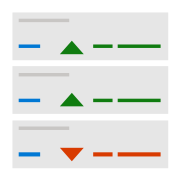
KPI Grid by MAQ Software allows users to track productivity and performance data by displaying key data in hierarchical order. Specify the time periods to show data and easily gauge performance according to internal deadlines and benchmarks.
Key Feature
- Customizable row background colors, text size, and text color
- Ability to include custom images such as rising or falling arrows
- Ability to include separators between columns, highlighting certain categories for quick comparison
Business uses
- Sales: Measure upselling success, quotation conversion, year-over-year sales, and other sales performance metrics
- Marketing: Measure bounce rate, click-through rate, and other marketing performance metrics
- Human resources: Create and staff advocacy scores, diversity indexes, and other operational metrics
- IT: Track cost variance, schedule variance, and project status
- Finance: Track profit margin and operating profit margin
Feature walkthrough
MAQ SoftwareKPI Grid
For a demo video, please visit ourYouTube channelFor technical support, please visit ourPower BI community forum
Contact Us. Thank you for using KPI Grid by MAQ Software. Have questions about this or any of our other Power BI custom visuals? For issues, contact Support@MAQSoftware.com. For priority requests or custom builds, contact CustomerSuccess@MAQSoftware.com.