All Power BI custom visuals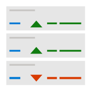
KPI Ticker
Display multiple key performance indicators (KPIs) in an automatically rotating visual.
Visual at a glance
Category
Single Metric, KPI
Certification
Power BI Certified
Best used for
Display multiple key performance indicators (KPIs) in an automatically rotating visual.
About KPI Ticker
Save space on your reports by displaying multiple KPIs in a series of rotating tiles. KPI Ticker by MAQ Software shows the percentage increase or decrease of multiple values. You can view whether values undergo positive, negative, or neutral changes at a glance with an optional color-coded trend indicator. KPI Ticker by MAQ Software works particularly well for applications with frequently changing metrics.
Key benefits
- Customizable tiles (quantity in each row and background color)
- Customizable font size and color
- Positive, negative, and neutral trend indicators (with customizable colors)
- Customizable tile animation
- Formatting options for tile layout (vertical and horizontal)
Use cases
- Travel – Represent flight delay information for multiple airline carriers
- Stock Exchange – Represent the changing values of multiple stock options
- Sales – Compare KPIs across all your locations in real time
Feature walkthrough
MAQ SoftwareKPI Ticker
For a demo video, please visit ourYouTube channelFor technical support, please visit ourPower BI community forum
Contact Us. Thank you for using KPI Ticker by MAQ Software. Have questions about this or any of our other Power BI custom visuals? For issues, contact Support@MAQSoftware.com. For priority requests or custom builds, contact CustomerSuccess@MAQSoftware.com.