All Power BI custom visuals
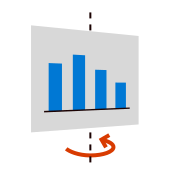
Rotating Chart

Showcase multiple key performance indicators with a rotating bar chart | Power BI certified

Visual at a glance

Category
Single Metric
Certification
Power BI Certified
Best used for
Showcase multiple key performance indicators with a rotating bar chart | Power BI certified

About Rotating Chart

Business reports often require many KPIs in a single report, especially when showcasing historical data. Rotating Chart by MAQ Software is a horizontal bar chart that rotates on its horizontal axis to showcase multiple KPIs. Each flip offers a new value, enabling you to show multiple KPIs in a limited space.

Key Feature

  • Customizable rotation axis (horizontal or vertical)
  • Configurable flip delay time
  • 3D effect option
  • Standard formatting options such as font type, size, and color for the label and title, background, and tile borders

Business uses

  • Sales: Analyze units sold over several financial quarters
  • Sales strategy: Compare sales data across financial quarters and departments
  • Management: Analyze the performance of multiple departments over time

What's new

  • Updated the visual to API v5.11.0, added the formatting pane file, migrated to ESLint v9, and removed deprecated dependencies and legacy functions to improve maintainability and compatibility.
  • Fixed audit issues, console warnings, React warnings, unique key prop errors, invalid SVG attributes, and rendering-related issues to improve visual stability and reliability.
View full details

Feature walkthrough

MAQ SoftwareRotating Chart
For a demo video, please visit ourYouTube channelFor technical support, please visit ourPower BI community forum

Contact Us. Thank you for using Rotating Chart by MAQ Software. Have questions about this or any of our other Power BI custom visuals? For issues, contact Support@MAQSoftware.com. For priority requests or custom builds, contact CustomerSuccess@MAQSoftware.com.
FAQs

What is the Rotating Chart visual used for?

Rotating Chart displays multiple KPIs in a compact space using a rotating bar chart. Each rotation presents a different KPI, helping users conserve dashboard space.

What data fields are required?

The visual requires category data and one or more KPI or measure values to display the rotating metrics.

Why does the chart rotate?

The rotation enables multiple KPI values to be displayed in a limited area without requiring multiple visuals.

Can I customize the rotation behavior?

Yes. You can configure:

  • Rotation axis (horizontal or vertical)
  • Flip delay time
  • Animation settings
Does the visual support a 3D effect?

Yes. The visual includes an optional 3D effect to emphasize transitions between KPI values.

What formatting options are available?

You can customize:

  • Font type
  • Font size
  • Font color
  • Titles
  • Background color
  • Tile borders
Which business scenarios is this visual best suited for?

Typical use cases include:

  • Executive dashboards
  • Sales reporting
  • Department performance tracking
  • Historical KPI monitoring
Can I control how long a KPI is displayed?

Yes. You can configure the flip delay time to ensure users have enough time to read each KPI.

Does the visual support report tooltips?

Yes. Rotating Chart supports Power BI report tooltips.

Is the Rotating Chart responsive?

Yes. The visual automatically adjusts to different report sizes and layouts to provide an optimal viewing experience across desktop and embedded Power BI reports.

Is Rotating Chart certified by Microsoft?

Yes. Rotating Chart is a Microsoft-certified Power BI custom visual.

Where can I report issues or request new features?

For support, bug reports, or feature requests, contact: customersuccess@maqsoftware.com . We regularly update the visual with enhancements and bug fixes.

Related visuals

Single Metric, KPI

KPI Ticker

View visual
Single Metric

Thermometer

View visual
